TIME
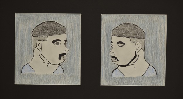
In this project that i did was that this guy loses his mom. Before he did he was okay and smiling. and the picture to the right is him after a couple years showing that it doesn't matter how much you stay the same it will always hurt. it also shows that just because he has a different emotion on his face doesn't mean he is the same as he was before.
TRICKSTER
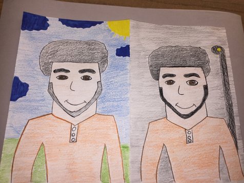
So my idea was to kind of have the same topic as my other project but i decided two of the same wasn't good enough so what i wanted to do was change the background more on this one. So in this drawing is this seventeen year old guy and he is the typical athlete at your school. Always plays around is good at school. And then on the other side of the picture (right) is him with the same smile same clothes, same everything. But the difference is the background. in this side he is getting in trouble, getting into drugs and not doing the right choices. As well as wasting his athletic career. And my point to this is that anybody can play or mess with you or make you see him as the nice person while his background is different. This is also like showing that you have to kind of meet the person and not judge on just the way he acts on one place.
Don't Look Back
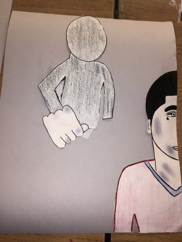
This project has to be my personal best. I tried to make this as realistic as possible and i know i still have to learn on a bunch of new drawing skills. But this project has to do with Domestic Violence. And my reason to this is because this has been a problem recently and i feel like something should be done about it. This once happen to me but this is kind of my story in a way. I tried to make the person one the right to kind of look like me. And what i did was try to make (my self) look bruised as if he was already hit and the bruses i think look realistic in a way. i tried making fist in the back, look big to make it look like hes getting hit again. and the thing is he isn't trying to fight back he just wants to let it happen and see whats next. I would've added more if i had a lot more time but i think it came out very good.
CEY'S
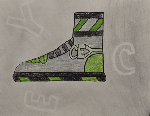
so in this project it was an everyday thing that we see and well i thought about it and i thought of so many things but the one that got me more was shoes. I really like shoes and well i was wanting to make a shoe so i went to google images looked at some Air Jordan 1s and well i kind of based my shoe of that. Now i knew i couldn't make my shoe design look exactly as the jordan so what i did was just take the high-top theme. Now the colors. I chose these colors because i like the army and well i was deciding on what colors i could use to match army. Then i thought what about Camo. so the bluish in the middle was supposed to be a little camo and the green to base of the army colors. I also tried to put a nike sign but i had to change it because it plagerism so what i did was make a new logo with my initials. Carlos Eduardo Yanez. (CEY) and i think it really came out pretty good. i also tried to put a bit more of my logo on the back just for some design. I really like how this project ended. Espically since it's my first time actually drawing a shoe. But i think it was good and i thought a lot about it a lot. I tried making it as original as possible and i think i completed that job.
